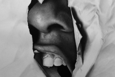
The above seen picture were six small drawings that were created with strathmore paper and dry materials (such as vine charcoal, black/ white conte crayons, charcoal pencil, graphite, sharpie, and more). Two of the pictures were cut 12 x 12, two were cut 10 x 10, and the last two were cut 10 x 9. All four corners of the paper had to be touched and this added to an interesting juxtaposition of the objects that were drawn. Throughout the drawing process vine charcoal was the most used material. With this being stated, it made it hard to focus on some aspects because this charcoal is easy to move, yet it’s also very easy to blend.
I feel that this project was interesting in the sense of what people chose to focus on in the small drawings. An example of these would be the picture of a glass bottle (lower left-hand corner). There were objects behind it, therefore this presented the option to either of focus on the bottle itself or the objects behind it. Using the white conte crayon and vine charcoal I was able to focus on the bottle while making the objects behind it noticeable. This was something that originally concerned me about the glass bottle, however it turned out better than I thought it would.
Something that I felt was done well throughout my drawings would have to be the lack of fear that was show using darker tones. I feel that this created nice shadow when needed (the picture of the apple and watering can) or just a contrast to the objects I wanted bring to focus.
The position of the objects in the drawings could have been better placed in order to create more of a stark contrast. This coupled with the lack of detail (middle and right-hand bottom pictures) are things that could have been done differently. Overall the pictures aren’t terrible which is something I’m proud of. The assignment was to show positive and negative space and I’d like to think that it was accomplished in my drawings.